Thanks for looking. Please share this post with others you feel will enjoy it too. If you’re interested, this is what my photography life looks like right now.
Hunting for beauty and balance, camera in hand

Thanks for looking. Please share this post with others you feel will enjoy it too. If you’re interested, this is what my photography life looks like right now.


ooh…sonnet 73
Bare ruin’d choirs
I had to google that one, gosh, how beautiful.
It reminds me somehow of the intro to Look Homeward, Angel…
https://www.goodreads.com/work/quotes/1156378-look-homeward-angel
Well seen.
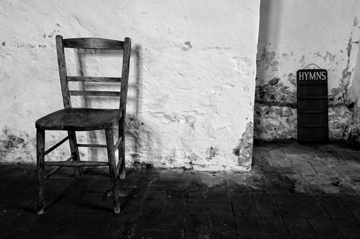
I hadn’t even considered doing more than one frame posts really. Just old school I think. Or old church in this case.
Thanks Bear. The main reason I usually post more than one image is as a little visual relief from the text for the reader. My posts tend to be rather wordy! Though I am becoming more concise, in 2018 the average is post length is 716 words, compared with 1075 in 2017 and 1194 in 2016! I might be sub 500 words by 2020… 🙂
Well, one frame is enough if it’s this great!
Thank you Frank for your kind words.
This image just works, fine effort Dan.
Thanks Martin, much appreciated. It seemed too good a composition to walk by.
This one is very well done.
Thank you Reinhold for looking and commenting.
… you know that I like lot’s of your b&w work … it inspires me 😉
Thanks Reinhold, I really appreciate you saying.
I would have liked to see some more dynamic range as I find the tones a bit ‘crushed’ and too contrasty (yes, I made up that word) and the white walls looks a bit grey (would’ve backed off on the vignetting – but that’s me)
I do like the symmetry and placement. Too bad the chair pulls your eye out to the left, but again, that’s just me 😉
Nice composition and handling of the subject matter. It think it conveys what you tried to say about the scene, and how you are searching for that ‘something’
Nice one mate
Thanks Anton, always appreciate your presence.
Re contrasty – I use this word all the time! I think I will often lean towards more contrast to simplify the image further. So there are less graduations in the tones. In reality for example the little shelves on the hymn board were more visible, but increasing the contrast has made these (intentionally) disappear a little. Similar with the floor tiles. I’m not one for “bring out the detail in the shadows” which is a phrase I heard a lot online when I was on forums more. I like black areas to be black!
With my three main cameras now I’m trying to get a similar look with each, especially with b/w. With the Pentax Q I can do it with in camera settings, with the Ricoh GRD III and Sony phone they need a bit of help via Snapseed.
With the composition I’m trying to explore how the chair might relate to the hymn board, and specifically how they are both empty and somewhat abandoned looking. Something of an equivalence thing going here, or at least an attempted one. But of course if we have to explain our photos too much they haven’t had a string enough impact or made a direct enough connection in the first place (like jokes!). 🙂
‘Bringing out the detail’ is a term that pertains to shadows and highlights, and is from the good ol’ days of prints. Well, sometimes not so OLD 😉
I used to enjoy an almost graphic feel to my images. In the when I salivated over Moriyama and Araki. But when I starting wet printing, I discovered that I was looking for a more well-balanced image.
And also herein lies my main issue with online viewing… Everyone’s monitor is different. You created this image with certain tonal values, and how you wanted to interrupt the scene. If my monitor is not calibrated the same as yours, I have no chance of seeing the image as you intended me to.
And herein lies the main advantage of making hard copies… You see EXACTLY what I want to show you.
Yeh I don’t like super graphic so it’s all black or white, with nothing between, but I certainly (currently) lean towards the contrasty look that the GRs are known for anyway.
That’s a great point with monitors. I remember some years ago design a website and having some beautiful subtle greens. Then I viewed it on a PC with a cheap monitor (which at the time most of my audience would also be doing) and the greens were garish and ugly.
You’re right, a print is a great equaliser of tones and colours that you can’t argue with. But it’d be pretty expensive to send prints to a few hundred people for each of these posts. ; )