")
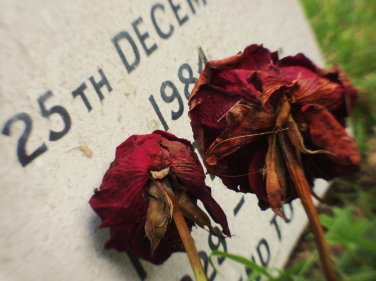
Since last October I’ve photographed almost exclusively in black and white. So what’s got me keenly embracing colour photography again?
The black and white phase began with the coinciding of two events – the autumn season and the arrival of a Ricoh GRD III.
I only ever intended to shoot b/w with the Ricoh, and the further acquisitions of a Ricoh GX100 and Pentax Q (let’s call this trio the Ricoh Pentax 3 (RP3)) further embedded this.
Especially as the Q has an excellent on board bold monochrome mode that I can tweak to give me the kind of moody b/w shots I like straight out of camera with no post processing.
Black and white has also been a natural choice for me over these last nine months or so as I’ve continued to strip down and simplify from the excesses of my camera collecting days of two or three years ago.
I find b/w images more direct – the absence of colour means one less layer of complication.
Light and shadow and shapes and textures come even more to the foreground. The raw essence of photography.
Plus with the Pentax Q I’ve been using the images straight from the camera, and even with the two Ricohs and my Xperia phone, I use the same simple Snapseed preset to increase the contrast and mood.
Again, a very straightforward, no frills approach.
Shooting colour previously with a Sony NEX I’d tried dozens, perhaps hundreds, of LightRoom presets.
Many I liked for five minutes, then found another I liked more and wondered whether to go back to the previous images and re-process with the new preset.
I quickly got into a complex web of choices and layers and ever more minuscule adjustments that took the joy of photography away – especially when with film I’d never post processed any photos, just taken them as they were from the lab scans.
I wanted a digital colour approach that was just as direct, consistent, and rewarding as my old film workflow.
Fortunately I found it in the spring of last year with a Pentax K10D DSLR, which combined with the Pentax K and M42 lenses I already had, gave me colours I loved directly from the LightRoom RAW to JPEG exports.
The b/w and RP3 season arrived though, and despite the K10D remaining a game changing digital camera for me (and the one which pretty much put the nail in the coffin of my film photography), the size and handling and interface and performance of the RP3 made me question whether I would ever go back to the bulk and weight and complexity of a DSLR.
So if I was to shoot colour again, it needed to be with one or more of team RP3.
Another happy coincidence was changing my phone from an iPhone to a Sony Xperia. Because my previous processing tool Hipstamatic is iOS only, I had to look for other options for the Android phone.
Enter Snapseed.
Setting up presets with Snapseed is super easy. And somehow because the whole app is simple and visual and tactile and phone based, I feel freed from the ridiculous over complexity of LightRoom (which I ditched for other reasons anyway).
Part of this release is from feeling tied to seeking out specific film emulation presets, which aim to make digital images look like they were made with particular film emulsions.
With Snapseed, I didn’t care what had come before with LightRoom. I just wanted a way of taking the already reasonable colours from the RP3 as a starting point and making them a little warmer, a little more nostalgic and a little more memorable.
So I’ve set up a “warm colour” preset in Snapseed I’ve started to use to make colour photographs again.
Now, rather than take a colour image and then face the daunting interface and thousand and one preset options of LightRoom, I already know what the final image is going to look like, from having that single simple Snapseed preset I’m familiar with.
Shooting now, with those processing decisions already made, I can contemplate the colours before me more freely again, without the kind of pre-emptive decision-heavy baggage the LightRoom workflow was giving me.
In time, I’d like to use the Pentax Q’s on board settings to create and store a similar “warm colour” look in camera, as I’ve done with the Bold Monochrome settings.
Which I feel is entirely possible – the depth of controls within the camera is mind blowing. With this in place, the Q – for b/w and colour – is comfortably the only camera I need.
What are your thoughts about shooting colour? Do you go for a consistent look across all photographs, or does it vary?
Please let us know in the comments below (and remember to tick the “Notify me of new comments via email” box to follow the conversation).
Thanks for looking. Please share this post with others you feel will enjoy it too. If you’re interested, this is what my photography life looks like right now.


Although I probably prefer B+W to color, I shoot both. I just try not to mix it too much – I do like some consistency. In my mobile “Fragments” series of the past weeks, I chose color OR black and white at the start of a new week/post (like choosing between B+W or color film). And I do make different photos depending on this choice. Black and white is more street-ish, in color I tend to go for striking colors (duh) and minimalism.
In terms of post-processing, it’s also Snapseed for me. When I still had an iPhone, I did color in VSCO, but the output of VSCO’s Android app is somewhat unpleasant. So now I have two Snapseed recipes, based on the “film” presets X1 (cool) or X3 (warmer), and that’s it. Simple and consistent.
Robert, like you I do struggle now to switch between the two. I’m still strongly in a b/w phase, but with so much summer colour around it seems remiss to not capture some of it. I can’t imagine going fully colour, but can easily imagine fully b/w.
I’m curious about your Snapseed recipes and how you made them. Did you already have an image made with colours you liked, then used Snapseed to try to emulate that, and save it? Or you just explored with Snapseed until you found the look(s) you like?
It verges towards the gimmicky end of things, but there are certain vintage tools (like Retrolux) where I occasionally just play with the random generation and see what happens too. Then make a further adjustment to basics like contrast and brightness and save.
1231/5000
Dan, my Snapseed workflow has evolved with trial and error. Especially by comparing my first experiments with the histogram of some film scans on my laptop, which were a good starting point (and usually way more neutral than the “film presets” in apps or Lightroom).
It is pretty straightforward. (1) Straightening if necessary, and often adding some vignetting; sometimes I use the Portrait tool to brighten up any faces. (2) Details: sharpening, especially old files; the current Huawei photos are already pretty (or even too) sharp. (3) Tune image: looking at the histogram and adjusting the brightness, shadows and highlights (I use the auto option as a reference, to be honest). (4) Grainy film: depending on the photo, applying preset X1 or X3 (I believe the X stands for x-processed), and setting Grain slightly lower. (5) Last check in Tune image.
That is it. Personally, I stay away from options like HDR, Drama, Grunge or Retrolux as I want the results to be as neutral as possible. I am not saying this is the best workflow (it certainly is not), but it works for me. It means I can post-process a photo in less than two minutes, the results are consistent and – most importantly – I like them.
My color photography is about as simple as it gets. I only use my iPhone X which automatically uploads the pictures to Apple Photos. I occasionally play with the filters in the Photos editor but nine times out of ten I prefer the unedited version. And I only make 4 by 6 prints of my color pictures.
Doug, that is a place I’d like to get to. I’ve been playing with my Pentax Q in the last few days (can’t remember when I tried shooting colour with my Ricohs, they’re pure b/w machines), trying to get a colour profile straight out of camera. It’s close, but I still prefer what Snapseed does, and for the extra 15 seconds of processing, it’s worth the improvement, for me.
I read this and thought, for the first time ever, ‘I wonder if my camera has a B&W mode?’ Apparently it does. It can show the image in B&W in camera.
Well, you live and learn, etc, etc. I might try this out sometime but I don’t seem to have needed it so far.
As you can tell, I come from much simpler times. 😉
When I “graduated” from cameraphones in 2011 to my first dedicated phone, a Nikon Coolpix, it had a high contrast b/w mode. More important than liking the b/w images it produced, it pretty much taught me how to see in b/w, and the different things to look for, compared with colour. I still prefer now to use similar b/w modes on my compacts, so what I’m seeing on screen is closer to the final image.
Yep, I sort of knew mine could do it but I thought it was only in a scene style mode and only worked on the JPEG’s. Turns out the viewfinder can be B&W in a ‘Creative Style’ mode and you can still shoot RAW only (which I do exclusively).
Tried it out today and found it a bit weird after a lifetime of SLR finders and ,like you, having an eye that ‘sees’ B&W anyway, but useful overall and worth persevering with I think. So thanks for you triggering the curiosity to discover it!
Yeh my main three cameras allow a b/w mode but retain a colour RAW if you need it. Not that I do, but I know the feature is there.
How amusing you’ve learned something useful for your b/w photography after a post where I’m trying to embrace colour photography more!
Yes, it’s the sort of contrary juxtaposition that I specialise in.
Dan, your shift into color has made me think I need to look at shooting in black and white. I haven’t done that in a long time. when I did photography at college we could only process in black and white. thanks for the inspiration. looking forward to seeing your color photos. xoxo susanJOY
I never say never but currently I can’t see me shooting much colour, and couldn’t imagine giving up b/w. It just enhances those core aspects of light and shadow and shapes and textures in a way I can’t quite seem to do with colour because there are too many other variables. I think it’s made me a better photographer too, because with colour, even now, I’m perhaps often more drawn to just capturing pretty colours than the overall composition and quality of a photo.
I have 3 Monochrome cameras and I love the increased sharpness and increased resolution of them. However when I go out with one of them (now almost exclusively the Sony mono.) I also have to bring a colour backup camera. Because I was in a strange location that I would not be returning to and I only had the Sony mono with me. Well what did I see, a group of yellow flowers of the most amazing hues. They were recorded in high resolution Monochrome. But to get the colours I was forced to use my iPhone. Which made me feel really bad due to my hatred of cell phone ‘photography’. Also the same thing happened when I saw a ‘British Racing Green’ D type Jag at the side of the road. I only captured it in monochrome because I forgot about my colour capable iPhone. So after 2 screw ups, colour backup camera is a must for me.
Also to answer your question above, I like varying my colour output.
I agree to a large extent, and find that whilst I’ve come to prefer black and white, and could comfortably shoot just b/w all year round, there are certain times of the year and certain situation where, like you, I just want to capture beautiful colours. Occasions where it seems a waste not to.
But with these shots more often it is nearly all about the colour, and I don’t necessarily focus on the same core elements of the image as I do with b/w.
I don’t know, it doesn’t feel quite as authentic, more like I’m capturing colour because I should, when I’d rather be shooting b/w. Does that make any sense?
Yes, makes sense. Some photos work best in mono, some are best in colour.