 – Cross Processed Ricoh GRD III")
This is the latest post in my ongoing quest for colour where, having been happy with my black and white output for some time, I’m trying to find similar satisfaction with colour images.
Last time I experimented with my little Pentax Q and its “Vintage Colour” settings, after realising that I didn’t want to make colour photographs that look exactly like the subjects do to my naked eyes.
Since then, a comment by Doug was an absolute revelation for me.
What he suggested – and how I further interpreted it – is we are so saturated with high quality colour images from all directions – TV, online, shops and vehicles plastered with posters – that we’ve become bludgeoned into boredom by it.
What I realise has happened for me is – even since the height of my 35mm film days six or seven years ago – I’ve sought out colours that are deliberately shifted from what we see all around us, just to see something different.
So with film I loved cross-processing (also called x-pro) slide film, making my own redscale film, exposing both sides of the film, and of course black and white.
The colour film I settled on with most consistency was the lovely saturated FujiFilm Superia 100, which took nature and amped it up.
And now with the Pentax Q, so far and most recently with its on board high contrast monochrome, and “Vintage Colour” options, again I’m exploring colours that are quite removed from what I see all around me every day.
So it made sense to follow this trail of altered colours further.
In the meantime I came across Steve’s review of the Ricoh GR which reminded me how much I love my older version, the GRD III, and how it hasn’t been used for a few months.
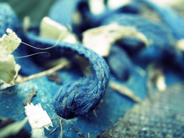
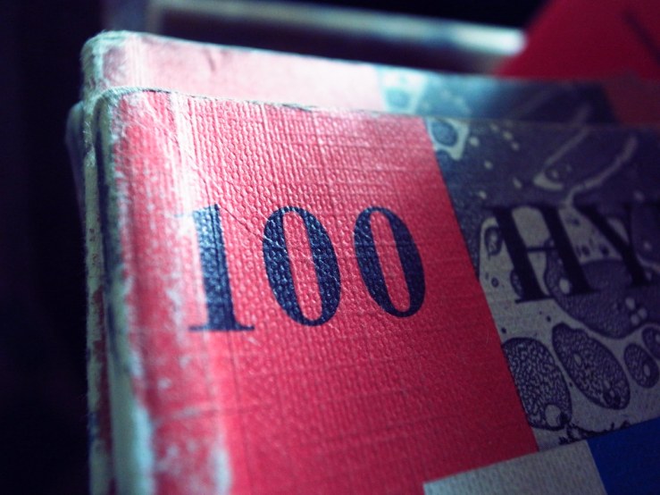
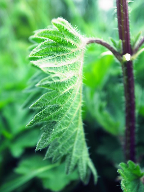
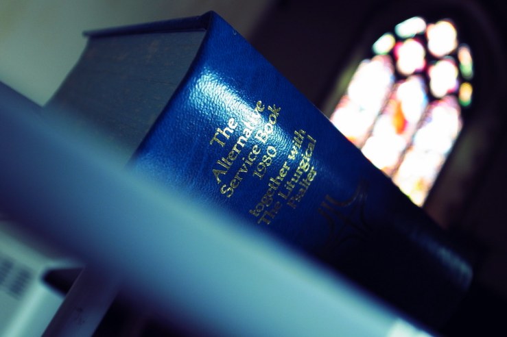
So I dusted it off, and rather than going with my default black and white set up, decided to play with the “cross processing” options.
Having cross processed film in the past I know what it can look like.
The Ricoh’s x-pro output of course isn’t quite the same as film, but does give a similar palette of shifted colours I find interesting.
I also remembered what a fantastic camera the GRD III is, especially its wonderful lens (f/1.9 and focusing down to 0.01m), and its handling being second to none.
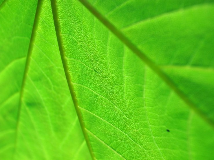
All of the photographs in this post were made with the Ricoh GRD III and a cross processing set up.
It’s not a colour approach I’d want to use every time I go out, but certainly one I like more than enough to try again soon.
The Pentax Q also has cross processing options, so it will be interesting to compare that with the GRD’s too.
The colour quest continues!
What kind of colour photographs are you making currently?
Please let us know in the comments below (and don’t forget to tick the “Notify me of new comments via email” box to follow the conversation).
Thanks for looking.
What Next?
Share this post with someone you think will enjoy it using the buttons below.
Read a random post from the archives.
See what I’m up to About Now.


Very nice Dan. Ricoh seems like an interesting company, I like that they kind of go their own way.
Thanks Jon. Yes I’ve had a number or Ricohs, they’ve all handled very well, with intuitive design and interface and excellent lenses. They’ve merged with Pentax now of course but still produce cameras like the GR (now version III).
Back in the film-shooting days we’d select a roll based on its known colour attributes. Kodachrome, as the song says, gives us those nice bright colours; saturated and warm. Ektachrome was higher speed, cooler toned, and less saturated. Agfa produced films with “euro-colours”, i.e. muddy. Fuji came out greenish every time. Some of this was purposeful on the part of the manufacturer. And of course we had filters that could change colour temperature too. These days digital makes it easy to shoot and adjust later. All I ever seem to do is tweak contrast a bit so it does look like what my mind’s eye remembers.
Marc, thanks for your thoughts. Yes I did similar with film, after a while you know which ones you like and how they render colours.
This is why I like having a set up in camera. Then I just stick to that and shoot without any intention to alter anything afterwards. Otherwise the processing possibilities are literally endless, overwhelming, and time consuming, and take me away from my favourite aspect of photography – being out exploring with a camera.
[…] Incidentally, all three images were made with Ricoh GRD III with an in-camera cross processing set up. You can read more on this in my recent post on my colour quest. […]