
This is the latest post in my ongoing quest for colour. You can read my colour photography story so far here.
In short, whilst I’m very comfortable and happy with black and white images – either using a Snapseed preset I’ve made, or, even better, straight out of camera with the Pentax Q and Lumix LX3 – I’ve struggled to find a colour “look” I’m as pleased with.
This next phase in my search for a colour set up I like began with the premise that I wanted a “natural” look.
This arose more from the beating stick end of that old donkey metaphor than the carrot, an “away from” motivation, rather than “towards”.
In other words I was moving away from what I definitely didn’t want – garish, fake, overly digital HD colours – rather than towards what I do want. Which perhaps I’m not sure about.
The Pentax Q, my current beau, has a range of colour settings, and the default “Natural” mode indeed gives very neutral and natural colours, impressively true to life.
But somehow these are too bland for me.
For some the holy grail of colour photography is finding a camera and lens (and film) set up that gives colours exactly like you see with your bare eyes.
I realised from my previous preferences however, that I don’t photograph to capture things as they are.
That is of course a valid type of photography, but I favour what I consider a more artistic approach, and a step removed from what my eyes see, adding my own interpretation of reality rather than presenting it completely unadorned.
For a start, my favourite b/w look is, well, black and white, obviously not natural as we see the world in colour.
Furthermore, I up the contrast and lean towards underexposure to make the blacks thick and inky, and the whites crisp. Fifty shades of grey is the antithesis of my monochrome style.
The colour photographs I have liked most in the past – made with FujiFilm Superia 100 film and the Pentax K10D’s CCD sensor – have not been that natural either.
Both exaggerated colour and are more saturated and larger than life than the colours I saw in the flesh.
I also remembered another colour set up I liked, in Snapseed, which I named “Warm Colour”. I’ve used in the past shooting digital compacts with neutral settings then adding the Snapseed preset after, with very pleasing results.
So I realised that “natural” was not quite the goal I initially thought it was, and achieving what I want with colour is not going to be so simple.
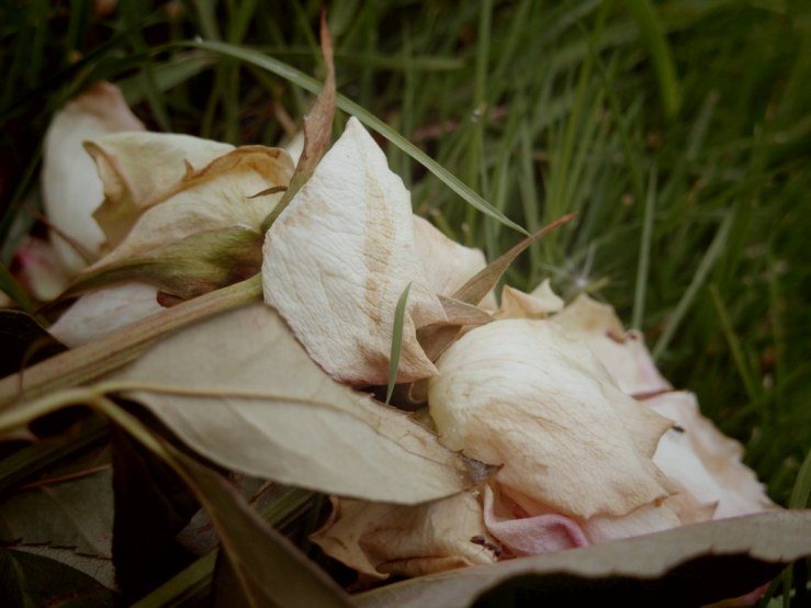
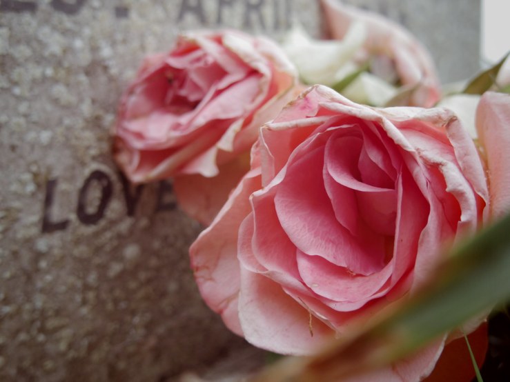
Needing to start somewhere, I decided to explore one of the “Smart Effects” in the Pentax Q, called Vintage Colour.
I don’t know exactly what it does, but the colours are more on the subdued and muted side of natural, without, I think, looking too much like a digital preset desperately trying to emulate film.
The three photographs in this post were shot with the Q and the Vintage Colour Smart Effect, with no other processing.
I like the colour of these photographs, and I think they suit the fact that in each of them the subject matter is already faded and decaying in some way too, a common theme in my photography anyway.
But I took some black and white photos afterwards on the same photowalk and the best of those I vastly prefer.
Plus I haven’t had a desperate urge to photograph in colour for a long time, I tried it here as an experiment and something different to explore. I’m not sure I’ll rush out to repeat it.
We’ll see what happens next with my Colour Quest, as I contemplate this set of photographs in the coming days.
Perhaps a different colour set up with the Pentax Q, or perhaps a return to 100% b/w for a while!
How do you decide when to shoot b/w and when to shoot colour?
Please let us know in the comments below (and don’t forget to tick the “Notify me of new comments via email” box to follow the conversation).
Thanks for looking.
What Next?
Share this post with someone you think will enjoy it using the buttons below.
Read a random post from the archives.
See what I’m up to About Now.


Hmm, the last question Is easy for mech… I shoot Color or Black and White according to the Film in my Camera. Easy peasy.
I certainly don’t go for that new HDR stuff. I prefer my colors subdued. Mostly, but not always.
Ah, but what motivates you to choose colour or b/w film and load it in the camera in the first place? And what are your favourite colour emulsions? Good to see you Frank!
Normaly the type of Film Is determined by mood only. I love Portra, but it’s expensive! Agfa Vista if I can get some, or any cheap Kodak consumer Film are OK mostly.
Never tried Portra! Yes I had great results with the AgfaPhoto Vista Plus which is rebranded Fuji C200, and Kodak Color Plus, both pretty cheap.
Hi Dan, Interesting timing, I was just out with my camera today hoping to capture some nine Spring colors after being sick for over a week. The weather turned ugly and it didn’t work out, but I had a nice walk anyway. For me if I shoot color, it’s digital, except for special occasions. I do love Ektar amd Portra color film. My favorite is black and white though, and I think it’s interesting how even people with little to no interest in photography react to B+W pictures, they really impress people for some reason, at least in my circle anyway. I like the colors you came up with from your Pentax.
Thank Jon. Yes with b/w the pictures for me are instantly more eye catching because they are already different to reality, they’re an alternative interpretation. Just taking pictures in fairly standard, neutral colour is just kind of documenting the scene, without making any artistic interpretation. If that makes sense.
Although I always thought I would shoot more monochrome, I clearly prefer color. The neauticule greens of spring and summer, the colorful flowers of spring, the fall foliage all make me shoot color. I prefer waterfalls in black and white in any season. I must say that the color set up you showed for the Q was great. Did look like vintage film to me. I hope you shoot it. Very engaging set up. And the Q is superb!
Thanks Martin, yes the Q is long term keeper for sure. So versatile.
I’m not familiar with “neauticule”, what does that mean?
High quality color pictures are so ubiquitous these days – television, computers, smart phones, billboards, magazines, catalogs, etc. – that they hold little interest for me. When I see a color photograph I first see the subject and then, perhaps, the photograph as an object in and of itself. In contrast, I am drawn to black & white pictures. When I see a black & white photograph I first see the photograph as an object and then eventually the subject.
That’s why I only take black and white pictures with my film cameras, and why I only take color pictures with my iPhone because it’s often inconvenient to switch to the monochrome mode.
Doug, this is a fascinating point! You’re so right, we are completely saturated by high definition colour imagery all day every day. I think like you this is why I’m almost immune to colour, my senses have been bludgeoned into submission. Black and white is timeless, and a return to something simpler, more pure…
Thanks, this is a very thought provoking angle…
I’m interested in your “Snapseed preset”. Can you tell a bit more about that? I used to shoot colour and b&w 35mm film, and trying to print b&w prints from colour negs never worked well. I thought I could tell what subject would work better with which film, but now that I regularly, just out of interest, look at what my colour digital pics look like in b&w (using Snapseed), I find that lots of things I thought needed colour to work look fine, and sometimes better, in b&w. I always thought that b&w was “serious” photography, and have always liked b&w better; and understand your disappointment with often garish colour; and your preference for a more subdued rendering has encouraged me to rethink my approach to colour.
Hi Peter, thanks for your input.
I mostly use two Snapseed presets, one I call “Warm Colour”, the other “Vintage Colour”.
The latter I probably only use for family shots really.
The Warm Colour preset I use for most phone and digital compact colour shots, to give them more warmth and contrast.
The actually settings are pretty simple. From scratch if you go into Tools then Tune Image, and then just increase contrast, saturation and warmth, perhaps drop the brightness a little too. Then when I settled a look I liked I saved it as one of the Styles so I can use it with a couple of swipes and taps next time.
There are also tutorials within Snapseed that step your through different looks, and can be very helpful, even if you use them as a base camp to then try your own variations.
If you open an image in Snapseed, then go to Tools and Tune Image, then at the bottom right there’s an icon like a bookmark with a star on it. Tap that then look through the Tutorials.
Hope that helps, let me know how you get on.
For me the luxury of digital is that the choice between black-and-white and color can be made afterwards. This usually means black-and-white for documentary/street/portraits and color for more urban-like or abstract work or anything that should be primarily aesthetically appealing (in the spirit of, for example, Ernst Haas). The VSCO preset that I currently prefer is an emulation of Ektachrome, with enhanced saturation and strong blues.
Yes, very true, though personally I prefer to make the decision before I shoot, as I look for different kinds of qualities in a composition depending on whether I’m shooting (and seeing and thinking) in b/w or colour.