Since around October (after the day the colours fell) I’ve been shooting almost exclusively in black and white.
Aside from there being less colour around to capture, I realised again that shooting in b/w makes it easier to focus on the core aspects of photography – light and shadow, composition, geometry, texture. Regular readers will know I like to keep things simple.
That said, I am still interested in finding ways of making colour photos that I like (even during my predominantly b/w season), and with as close to zero processing as possible.
After a few years of on and off experimenting, essentially for me there are three types of colour I enjoy.
Natural Colour
First, natural colour – as close as possible to what my eyes saw in reality. This is most preferable when the original photo was made in very good light, so the colours were at their most vivid, yet still as nature intended, not overly saturated.
My photos taken with my Pentax DSLRs like the K10D are largely untouched except exporting to JPEG in LightRoom.
What I’d like to look at in this post a little more is the other two types of colour image I enjoy and have been “developing”.
Warm Colour
When the natural light is than ideal, which is about 90% of the days between November and March where I am, this is a way of adding a little more character and warmth to images that would otherwise look flat and lifeless.
Here are a couple of examples, shot with my Ricoh GX100, and showing the original straight out of camera (9MP Fine JPEG) image first, then a “Warm Colour” version, processed in Hipstamatic.
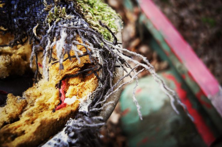

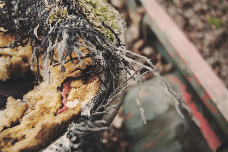
Muted Colour
I’ve been using this in very similar conditions to the Warm Colour, when natural light (or at least sunshine) is lacking and the colours seem uninspiring.
This pallette I see almost as halfway between colour and b/w. There’s been a trend in movies and tv shows in recent years to use very muted (and mostly green and grey) palettes and I guess these have been something of an influence here.
Here again are two examples with the same original image as above, then a Muted Colour version processed in Hipstamatic.

How do I choose which colour palette to use?
I really like both the Warm and Muted processes here. My choice of which to use for any one photo (or batch of photos) I think comes down to two factors.
First, the mood I was in when making the images.
The more subdued the mood, the more subdued the colours, so the final processed photographs most accurately reflect the images I have in my head (ie my memory) of the photowalk.
If I was in a brighter mood, then the colours I want the photographs to hold are brighter and warmer too.
Second, the subject matter, and the amount of colour that was actually present.
If there was a scene with lots of colours, even if the light was muted, I’m more likely to use the Warm Colour processing to enhance that range of colours.
If the original scene had only very few colours, as well as subdued light, then the Muted Colour processing seems a better fit.
Of course none of this is an exact science, and it’s all my personal preferences. Which may well evolve over time.
What do you look for in your colour photos?
How do you decided which colour film or digital settings to use before shooting?
What influences the colour processing you use afterwards?
Please let us know in the comments below (and remember to tick the “Notify me of new comments via email” box to follow the conversation).
Thanks for reading. Please share this post with others you feel will enjoy it too.


Interesting. Maybe I will order some colour film next time I get a bulk of B&W.
I’m guessing from your username you don’t shoot in colour much!
I’m not keen on all the overly lomo and gimmicky effects that a lot of filters can give, but I have become more curious especially how colour photography can be very subtle and muted, and still reflect the feeling of the winter season, when the vivid colours I capture all spring and summer aren’t around.
I’d not overlook colour this time of year Dan. I say this with irony of a bag of cameras all irritating loaded with B&W as on a rare day off I’m sipping posh mush coffee enjoying the golden hues and rich blues of a crisp frosty sunrise over Carlisle city centre. On a full day I’m with you- but on these crisp days with luxurious blues and golds I’m kicking myself to find I’m only B&W loaded
Yes I agree Alan that early morning / late afternoon winter sunlight can be stunning. But in recent times I can think of maybe two mornings out of 30 that have been anything like this (even down here in the supposed “Sunny South”!) So the steady dull greys make b/w and muted colours a more realistic option.
I expect the sunlight frost would still look pretty wonderful shot in b/w?
Great post! I have to be honest that the seasons really do have an effect on my choice of shooting black and white or color. I don’t know why and your post made me think about that. I live in the Midwest and in the winter I always find myself thinking it can only be black and white today but that shouldn’t always be the case.
Hi David, thanks for reading and your comments. You might like my post from a few months back about the seasons changing and feeling much more b/w – https://35hunter.wordpress.com/2017/11/02/the-day-the-colours-fall/
Do you notice a time in the spring when you have an urge to shoot colour again? What sparks it off?
[…] mono phase, partly because I just love the simplicity of black and white, and partly because I haven’t really found a consistent way of making colour photographs I […]