
The last time I used colour consistently was last summer with my Pentax K10D, approaching a year ago now.
Since then, I’ve enjoyed an extended mono phase, partly because I just love the simplicity of black and white, and partly because I haven’t really found a consistent way of making colour photographs I like.
I’ve come close with presets in Hipstamatic, then Snapseed, and not quite so close with the in camera settings of my Pentax Q.
Out on my first proper photowalk the other day with the Lumix GF1, trying out one of my favourite lenses I’ve ever used, an M42 Zeiss Flektogon 35/2.4, I was, as has become the norm, well immersed in monochrome.
The GF1, like its little sibling the LX3, has an excellent dynamic monochrome mode that gives me b/w images I like straight out of camera.
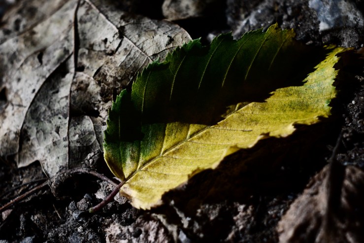
But then I came across a leaf on the forest floor, that epitomised the slow draw that autumn has over the summer. The colours were too beautiful to ignore and capture in b/w.
So I switched from the b/w custom memory I’ve created to a colour mode.
I half stumbled, half experimented through a set of “My Color” (alas the Japanese, like Americans, can’t spell colour) modes in the GF1, and one that seemed to capture the leaf just as I wanted – natural, yet somehow deeper, more vivid, more special. And yet simultaneously, a little moody and muted too.
Experimenting further, I managed to make a handful of photographs with this mode, after a little extra tweaking, and saved it as a custom mode.
So for now, I have the C1 mode for (dynamic) b/w and C2-1 for what might reasonably be called dynamic colour.
I don’t how much is the camera settings and how much the lens, but I know when I used the Flektogon both with film and with my DSLRs I was rarely disappointed. It has its own certain magic.
It will be interesting to see how this colour set up works with other M42 lenses, and, eventually, with a native Lumix Micro Four Thirds Lens, if I get one down the line.
With this combo though, it makes me very excited to shoot more with the GF1 and Flektogon combo, especially as it was very pleasing with b/w photos too.
How do you shoot and process colour photographs? Does it vary between cameras or do you have one consistent approach that gives you the same colours?
Let us know in the comments below. (Remember to tick the “Notify me of new comments via email” box to follow the conversation).
Thanks for looking. Please share this post with others you feel will enjoy it too. If you’re interested, this is what my photography life looks like right now.


Dan, my color photography is usually an explosion of different colors. Every so often I set myself a challenge like looking for a red object and the focus of the photo is mainly of the red object. I need to look at why I like so much color the way you love your focus on B & W xoxo susanJOY
Hi Susan, I thought you’d like a post with colour photos!
When I used to shoot a lot of film, I remember I read a “golden rule” – always shoot red. On film, red objects more often than not turn out very pleasing in the final image. With digital it can be harder to get a satisfying colour without it being overblown. This is something I want to experiment with, with this colour set up on my GF1 camera, see how it works out for capturing different colours. So far for greens it gets a big thumbs up from me.
I love colour generally in life, it’s very stimulating. Just with photography I find it easier to be more focused when shooting b/w.
I love the slightly muted colors (sorry, colours) in these photos. And it is nice if you can find in-camera custom settings that give pleasant images SOOC, or at least produce files that need less post-processing. Something I also try to do with the X100 – in black and white, as I decided to return to 100% mono –, but some post-processing will always be necessary for me, I guess.
Thanks Robert (I was just teasing, English is the most curious and quirky language!).
I have three cameras now that give me a look I like SOOC with b/w, and the GF1 works for colour too now. I think there might be further scope with my Pentax Q, I just haven’t tweaked enough yet.
What do you think is lacking with the X100, or in other words, what are you altering/adding in post processing that the camera doesn’t do?
There are a few things I add in PP: “grain” (not so much to simulate film, but to get some structure in the image; and “noise” is just not the same for me) and a some vignetting (to get the focus on the main subject). The grain feature is not available in the vintage X100, and vignetting is something for post-processing anyway.
And I like black & white with deep blacks (the X100 can produce beautiful blacks), but combined with highlighted shades of gray. So faces won’t be too dark. Currently, that’s just easier to get in PP, no matter what camera and/or settings I’m using.
I shoot mostly color and go for realism but struggle to perfect it. I’m used to the look I get from Fuji 200 or Kodak Gold 200 and keep hoping to just replicate that in my digital cameras but have not yet had much luck. The natural color setting on my S95 works well enough for documentary work but not really for artistic work. Fortunately I tend to lean on film for art anyway.
I think the only digital camera that has consistently given me the colour results I wanted, straight out of camera, is my Nikon D50, particularly with my 50mm f1.4 lens. Generally, I prefer shooting film for colour, particularly Portra, Velvia, Ektar and Fuji Superia or C200, although I am trying to avoid Fuji films now
Beautiful colour pictures … they are 😉
My own colour pics are usually slightly de-saturated. As I often do a black and white version – besides the colour verision – in postprocessing, I tend to do in-camera processing as careful as possible.
Thank you as always for your input Reinhold.
I really try to make the decision about colour or b/w before I take the shot and set the camera up accordingly.
Though in the past I’ve shot colour film, an converted a few to b/w and preferred them!
Dear Dan – and fellow photographers
The trouble with colour is matching a series of photo’s taken in different locations to make a colection into a harmonious whole. Look at the best colour photobooks or instagram sites – and see what I mean. That is why whenever I find light to be challenging – I also switch to B&W. But I am getting braver now with colour!
In the days of 35mm film – the colour theme was set by the film you bought and how you exposed it: think of Steve McCurry’s Kodachromes with their slight planned underexposure – that Kodachrome colour palette and grey blue sky set a theme for the images – they would have been totally different images in Fujichrome. That is one reason why transparency film was so good – you made the final photo as you clicked the shutter.
In digital – either you need to have a very determined plan of what to photograph, or find a colour mamagement system that works for you and set a colour theme for your “album”. Some cameras, such as those Lumix M4/3s have built in “colour management” themes to try out – in nature, I love the “expressive” theme.
But what to do for everyday photography? This is where “filters” and “presets” come in: I love using DXO -to process photos in bulk with presets, especially since the company gives away full-featured versions of its last generation software to get you interested at zero cost; but even Photos for Mac can do colour themes, alogside many free-to use editors – even the android phone ones.
The simplest theme is to reduce some of the rainbow spectrum of colour; this is what filmakers do. If you haven’t tried this technique yet – can I commend a short, wonderful YOU TUBE demonstration of this by the excellent Sean Tucker. The session is titled: “How to Edit Colour and Create your own Style”.
I too find a great pleasure in using “old digital cmeras” – since even the best Sony 1inch sensor compact is now outperformed by smartphone 4-lens electronics, we can browse the “back catologue” of photography equipment and not feel guilty that we are not creating the “very best” image quality. I find that just picking up an old camera- and learning to master it – is a great driver for my creativity.
Currently, I have found that the “style over content” Samsung NV9 (with design clues from the Nilon 35Ti), takes amazing dusk pictures in its “Night Mode”; while an Olympus Peni Mini with a manual 25mm lens from Meike can make a great black and white camera with fabulous JPGs straight out of camera (though always fix a hot-show thumb grup to those mini-pens as they slip through the hands !).
Keep the reviews coming plase !
Best wishes – Paul C in the UK