
For the majority of photowalks over the last couple of years I’ve shot mostly in black and white.
Partly this is because I’ve just enjoyed it more and been more in that kind of mood, partly because I find it easier (fewer variables means fewer decisions to make!) and partly because I haven’t until very recently found a camera that delivers colour images I like straight out of camera.
I was recently asked about why I shoot b/w or colour, and whether I could compare the same shot in both forms to show and explain why I made the choice I did.
So here are two from a recent photo walk with the Golden IXUS.
By way of introduction, I usually set a camera to a b/w mode so I can see on screen what the final image is likely to look like.
But with the IXUS 870, by accident I found that by using the Custom Colour mode where you can up the contrast and saturation a little, then converting to my usual b/w set up with Snapseed afterwards, I was getting more pleasing images than using the camera’s b/w mode, which is too grey, too washed out for my liking.
And whilst I prefer having the b/w shown on screen, by now I feel I’m experienced enough to be able to visualise what will look better in b/w without it.
So for this photowalk, I was aware of which images would be converted to b/w when I was shooting them, but shot them in colour with the plan to convert to b/w via Snapseed.
Image One
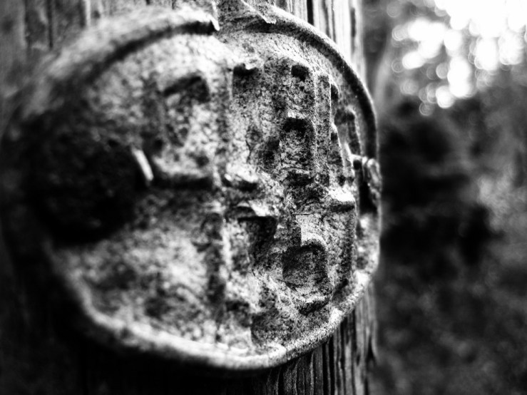
The main appeal here for me was the battered old badge nailed on to the telegraph pole, from what looks like 1957. These are common on these poles round here, and this is one of the older ones I’ve seen.
I also wanted a hint of the weathered textures of the wooden pole itself, and as I’ve learned that the Golden IXUS favours using as large an aperture and low an ISO as possible, I knew it would force a very shallow depth of field (because it shot wide open at f/2.8), and the in focus part would be pretty sharp (it used ISO100, just above the camera’s native ISO80).
So I knew the out of focus area in the background would look better to me in b/w too.
Here’s the original in colour.
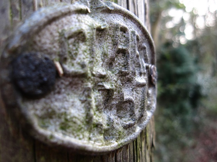
Of course the depth of field, focus and so on are exactly the same, you can’t change those after the photo’s been made.
But I knew because of the colours in reality, it would end up too washed out looking for my tastes, the background especially would be pretty bland, and that as a colour image the contrast and textures I wanted to highlight wouldn’t be anything like as pronounced.
So it was always going to be a b/w photograph.
Image Two
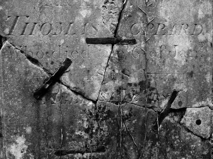
Again, the main emphasis for me here is texture.
I was amazed to find this repaired gravestone as so many of the ancient rural churches I visit have graveyards littered with broken and neglected headstones.
The fact that it was originally placed in 1818 (assuming this was soon after Thomas Oppard passed away) makes its history more enigmatic. The repairs are obviously not very recent as they are significantly weathered too, but whether this was done in 1820 or 1980, who knows.
Gravestones often have delicious textures. This particular one upped the appeal twice over with the cracks and repairs adding interest, plus the ivy trying to make its impression too.
Sometimes if a similar scene has coloured ivy leaves (either green living ones or dying brown ones) and it’s a sunny day, I might take a colour shot.
But here as there was virtually no colour in the scene, and no sunlight directly on the stone, b/w was again an obvious choice.
Also, I decided to shoot close enough so the whole composition was filled by the stone, and became more like an abstract painting with shapes and sections, rather than a picture of an object in its natural setting. Again I think the b/w enhances this.
Here’s the original in colour.
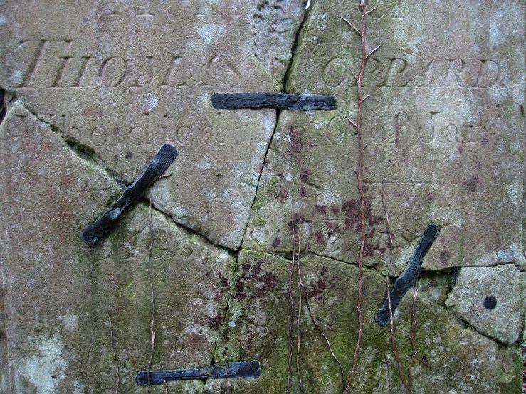
As you can see, whilst the subject is obviously the same, and has the same potential stories, it’s pretty bland as a colour shot, and the b/w choices enhance the drama and textures.
I hope this post gives an insight into my choices for b/w photography, and what I look for.
Typically, it is texture, light and shadow, shape and form.
I also tend to look for more dramatic compositions that suit the kind of b/w look I favour, ie higher in contrast, with deep blacks, rather than a sea of grey midtones (which is what the Golden IXUS (and indeed most digital cameras) tends to output with its b/w mode straight out of camera, again hence why I use the Custom Colour mode with extra control over the contrast and saturation, then Snapseed after).
How about you? What dictates if/when you shoot colour or b/w? Do you decide before you leave the house, immediately before you take the shot, or do you use colour and then try a b/w conversion afterwards to see how it compares?
Please let us know in the comments below, we’d love to hear about your experiences and decisions (and don’t forget to tick the “Notify me of new comments via email” box to follow the conversation).
Thanks for looking. Please share this post with others you feel will enjoy it too. If you’re interested, this is what I’m into right now.


Dan, do you find that a potential arrangement or composition or subject will sort of announce itself as monochrome or color?
I wonder if that voice is a matter or habituation after a lifetime of looking at B&W photos by the Masters or some innate human aesthetic instinct or a faint residual of accreted and informal “training” in common cultural values, the Art History of daily life.
I wonder if I have not been “trained” by exposure to regard monochrome as being either “for” dramatic fine art *or* a straight* journalist documentation, where B&W declares that this is a matter of recording stricts facts, without the distraction, decoration, or levity of color.
That begs the question: had color processes and reproduction been as cheap as monochrome in the early days of photography and journalism, would we now have a different mindset as to what color vs B&W “mean”, what freight of intent each carries?
Anyhow, by whatever means, in a location of shapes and tones and textures with elements like your old churchyards, I also would instinctively seek an arrangement for black-and-white. Similarly, while acclimatizing myself to a new Canon P&S, I came across a restored 1958 Chevrolet pickup truck perched and glowing on an orange gravelly berm in late afternoon light under a deep blue sky, and that of course bellowed Color.
Rarely, very rarely have I stumbled across a thing or place that would work either way. I can recall one instance – the courtyard of a working sculptor, with unfinished life-sized nude stone figure draped with viney tendrils against a battered and peeling overgrown shed. In the same place, I found his storeroom of supplies and tools around a beautiful reclining nude in glossy green stone surrounded by worn grinders, spent chisels, cardboard cartons, and old tarps. Both versions of each shot worked equally well, and I kept both.
William, thanks for your thoughts.
Well, that little Golden IXUS has thrown a spanner in the works with my usual approach. For some time I’ve made very few colour photographs because I haven’t been happy with the colours coming straight out of camera. So I’ve gone out with my b/w eyes in, and therefore sought out the kind of compositions that I feel are better suited to b/w, and not thought much about colour.
As the Golden IXUS has rejuvenated my interest in colour, the last two or three photowalks I’ve been on colour mode and so seeking out colour compositions. But because of the experience looking at the world in b/w, I’ve still come across the occasional scene that I feel would make a good b/w photograph, like the two above. Rather than ignore them and focus strictly on colour, I’ve made the shot, along with a mental note that this is one to be converted to b/w later via Snapseed.
Also, because the IXUS gives me b/w pictures I slightly prefer by shooting with the Custom Colour mode (where you can adjust six or seven variables inc contrast and saturation) then converting after, I’m not having that b/w preview on screen that I got used to. This, in fact, doesn’t make a huge difference, I’m finding I’m experienced enough to see in b/w without the camera at all. But it is a slight evolution from shooting in b/w mode, and one I will experiment with going forward into February as I take up my next One Month, One Camera challenge…
As for the influences behind why we consider something should be b/w, I hadn’t really considered this before. I think I automatically think of classic street photography as being b/w, because as you say at the time this was the dominant and affordable format. I do find too that b/w just makes many a composition more dynamic and dramatic, and larger than life. It accentuates the parts you want to accentuate. So I think of classic work by Edward Weston for example of peppers, shells, sand dunes and female nudes. I think the isolation and simplicity is a factor too. I don’t really do complex multi layered images with deep depth of field, I prefer to have a simple plane of focus then often a dramatic drop off in detail, or just a single plane like the gravestone image above. I think b/w helps with this simplicity and impact too.
I wonder if because my favoured subjects (gravestones, weathered doors etc) look better in b/w I use that more than colour, or the influence has been the opposite way around – once I chose to shoot b/w for a significant period, these kind of objects attracted me more.
Yes, some compositions beg to be captured in colour. Like the glorious bright red post boxes and old telephone we have over here, which sing in colour, but look desperately anonymous in mono.
https://www.flickr.com/photos/danjamesphotography/27390501024
It will be interesting to see how my balance between b/w and colour evolves as I try a new camera in February, and as the spring season unfolds, naturally providing far more opportunities for colour photography then December or January did.
Thanks for prompting my thoughts further!
Oh, well, you know, B&W photography coincidentally followed-on the values of drawing, of charcoal and graphite, where form and line and shape and even light, by the presence or absence of the marking medium gives meaning: “The Pencil of Nature” business. And drawing is older than Time, near; is about line and shape and stasis or movement: the duotone bulls of Lascaux, simple red, black, browns, e.g.
Color…I don’t know – maybe another language entirely, requiring another physical sense, almost.
The actual colors of the humdrum world we walk around are mostly dun; flat, faded, unattractive. Carefully handled, desaturated color can be very attractive, but it ain’t what the mainstream prefers. I recall an old discussion of the saturated green color bias of Fuji film emulsions; that they were formulated thus because Japan is a fairly gray and faded-brown place, and photos of it wanted some pop.
And people still wail and lament the passing of Kodachrome, and I remember someone in an article somewhere saying that the truth of Kodachrome is that is was surreal, psychedelic, and had little to do with the real colors of the actual world, when most of the daylight is flat and insipid for most of the day.
and again, there I go, blathering on off-topic as usual…
Beautiful … the gravestone in particular. I love how it’s been repaired. I have several very old plates and they have a similar way of being fixed on the back.
Thanks Katie. Even looking up close I couldn’t quite work out how the gravestone was held together or what these “ties” were made of, though they looked like very corroded metal.
Maybe they used some sort of lime mortar that they used in pointing brickwork or something … don’t know, but it’s a fabulous picture.
B&W definitely brings out the textures and details more. The images you’ve shared in this post are definitely better in monochrome, in my humble opinion 🙂
I usually decide before I leave the house whether I’m going to shoot in b&w or colour, but it’s not set in stone (unless I’m shooting film of course!). Most of the time when I use my GX7, it’s in b&w mode, but if I capture an image and I’m not happy with it in b&w, then I will switch to colour and take another photo.
Hi Mel, thanks yes it’s all about the details for me!
I’m very much like you – I nearly always decide whether I’m shooting colour or b/w but lately with the little “Golden IXUS” it’s encouraged me to not pass up the odd photograph in the opposite palette, if the composition presents itself.
Dan, thanks so much for this post. I am realising more and more that the things you photograph and the things you look for suit your b 7 w preferences whereas my love of color draws me to the photos I take. THanks again
Yes I think it works both ways. I happen to like decaying textures which tend to look best in b/w. But I also generally prefer shooting b/w so this draws my eye to decaying textures that suit it.
Hi Dan. As I have mentioned on an earlier post, I really like the natural colours I can get out of the older Canon compacts. When I’m out taking photos I often pre-visualize some shots as monochrome, just like I did when using film cameras! Good examples of this is when taking silhouettes, shooting against the light, and textures created by angled light. I guess that is one of the beauties of digital, to be able to switch the mind-set between colour and black-and-white, or to experiment at a later stage. When I go out walking with my camera I go with an open mind to the possibilities of both mediums. It all depends on my vision/ experience at the time! Thanks again for your thought-provoking blogs!
Thanks Paul, I really appreciate your input and comments.
Yes my month with the Canon IXUS 870 comes to an end today, and inevitably I’ve been wondering about what other cameras Canon made around this era with similarly pleasing tones colour wise. I think it’s highly likely at least one more Canon compact will feature in a future One Month One Camera experiment!
You can now change focus with some cameras after shooting. I have a Lumix GX9 and a G9 both of which I think have post focussing. However I have never used it because I prefer to make most of my decisions when shooting. I shoot raw using a black and white preview because you need the colour information for a good bw result.
Really, like focus bracketing? That’s crazy, and surely makes photographers even more lazy! Just spray away and bracket everything, then chances are one of those 137 shots you made of the same scene will have perfect focus, exposure and depth of field!
Like you Robert, I like to make my own decisions at the moment I’m taking the shot.
I used to shoot RAW and use a b/w preset or other, but I just don’t need that quality level for my needs, JPEG is just fine.
Thanks for stopping by and commenting.
The cameras I have now would allow me to shoot colour jpeg with a black and white preview. Still gives you colour channels to play with.
I wouldn’t know how to adjust the colour channels, but this has reminded me that when I used a little Canon IXUS in January, I found that shooting in the custom colour mode, where you could increase contrast and saturation, then converting to b/w in Snapseed, gave me photos I liked more than using the b/w mode then converting in Snapseed. I just had to visualise in b/w too.
I have other cameras where you can shoot in a b/w mode then it saves that and the default colour mode too, if you need to compare, adjust etc. I’ve just not really ever gone into that depth.