
This is the first post in an occasional series about my experiments in colour photography, which I’ve named “The Colour Quest”.
Let’s start with a little background.
In the 14 years or so I’ve been making photographs with intention, my approach to making colour photographs has passed through many evolutions.
When I began with a humble 3.2MP Sony camera phone around 2005, I did nothing with the colour.
I either used the camera on its default colour mode, or its default black and white mode, then uploaded the results.
I didn’t know there were any other options, and if I’d have heard the phrase “post processing” I’d have probably thought it was what happened at the local Royal Mail sorting office.
Perhaps most importantly, once I’d edited and removed the photos I didn’t like, I was pretty happy with the ones remaining – including the colours.
My first “proper” camera came in 2011, a Nikon Coolpix P300.
It remains the most I’ve ever paid for a camera, and I believe, aside from camera phones, the only digital camera I’ve bought brand new.
I quickly discovered the high contrast mono mode, and used it for perhaps 80% or more of the 7000+ photographs I made over the next seven months.
Colour images rarely got a look in, other than family shots. I just preferred black and white (and still do).
A year or two later, after starting to find my feet with film, colour photography was not just easier again, but almost irresistible.
I just chose the films I like best (top of the pile being Fuji Superia 100) and let my trusty local supermarket lab do the rest.
Again, I was more than happy with the colours of the photographs made with my favoured films.
On the digital front, I was experimenting with a Sony NEX 3N and what now seems a ridiculous number of vintage lenses in perhaps six or eight different mounts.
I never much liked the colour straight out of the NEX (rather cool and lifeless) so resorted to LightRoom and presets, starting with one I liked and tweaking to improve it further.
Sometimes these were subtle.

Other times the colour treatments seemed more radical.

Or trying to emulate some of the images I’d made with film.

The problem was, now I had film photographs (FujiFilm Superia 100 in particular) as a bench mark.
And even if I didn’t necessarily want my colour NEX pictures to look exactly like my colour film ones, I wanted to like them as much in their own way.
But I soon realised I didn’t like spending more time on processing than actually out making pictures, and explored other options.
Which led to the Pentax K10D with its lovely (and, ironically, Sony made!) 10MP CCD sensor.
This combo gave me lovely rich colours simply by shooting RAW at native ISO, importing to LightRoom with its auto tweaks and exporting as JPEG.

In their own style, I was as pleased with these colour images as with my Superia 100 film shots.
Success! Kind of.
The K10D DSLR was a hefty beast, and I was tiring using a viewfinder and manual focuse lenses – even though the K10Ds is excellent for a DSLR.
Photography with the K10D was just wearing me out.
So that autumn (2017) saw a significant shift – back to b/w and using drastically smaller cameras like the Ricoh GRD III and Pentax Q.

Since then, I’ve stuck almost entirely to compact digital cameras, shooting in b/w.
I’ve dabbled occasionally with colour (the Canon IXUS I used in January impressed me), but nine out of 10 images (and 99/100 with cameras like the Ricoh) have been b/w.
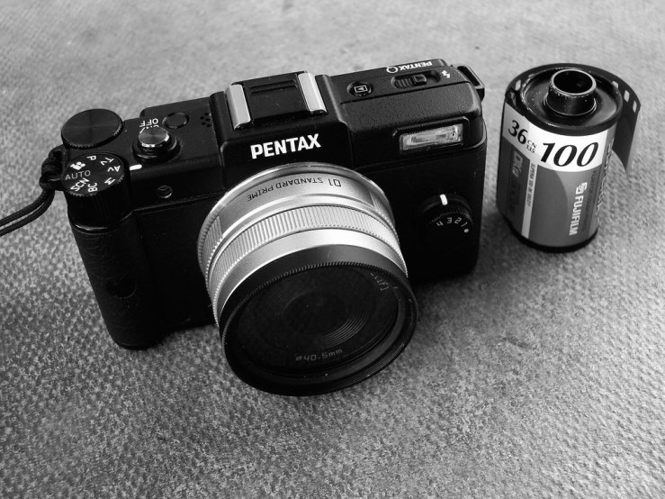
Currently I’m enjoying the little Pentax Q again, and the colour issue has peeped its head above the pulpit once more.
The Q has almost unlimited colour options.
First, there’s a Custom Image group of 10 settings that by includes Bright, Natural, Muted and Bleach Bypass.
Each of these has five parameters like Saturation, Hue and Contrast, which go from -4 to +4, which can all be set independently.
Then there’s a group of 11 Digital Filters.
Some seem too “gimicky” for my tastes, like Invert Colour, HDR or Fish-Eye. But others offer great promise, such as High Contrast, Extract Colour, and simply Colour.
Again, each of these has further parameters to increase the intensity of the effect(s) and the colour(s) it uses (or extracts).
Any of the Custom Image modes can be used with any of the Digital Filters. Or you can use one but not the other.
Furthermore there are a set of Smart Effects, with names like Unicolour Bold and Warm Fade, connected with the little Quick Dial on the front of the camera.
Or, the four slots of this dial can be used to save whatever settings you currently have set on the camera, so you can set up four different preferred colour options for example, and keep everything else (like focus mode, metering, aspect ratio etc) consistent, and simply just turn the Quick Dial between 1-4 to choose the required colour set up.
Which is eventually what I plan to do.
But before getting ahead of myself, I’m going to start simply, using just the Custom Image to choose something like Natural or Muted as a base point, and gradually explore from there.
When I’ve looked back at my colour digital photographs to research this post, those that make me smile most are those made with the K10D.
And those that have been, not so much disappointing to look at again, but have helped me remember just how much I really didn’t like faffing around in LightRoom for ages to try and find a look I liked, are those made with the Sony NEX and an almost never ending parade of different vintage lenses.
With my fantastic Gang Of Four compacts, that’s a set up I can’t see myself ever going back to.
Small cameras, and using the photographs straight out of camera, is the way forward for me.
Another post will follow in due course with my first wave of experiments and images made with the Q.
How about you, how do you like your colour photography? And how have you got to where you are now?
Please let us know in the comments below (and don’t forget to tick the “Notify me of new comments via email” box to follow the conversation).
Thanks for looking.
What Next?
Share this post with someone you think will enjoy it using the buttons below.
Read a random post from the archives.
See what I’m up to About Now.


Like you, I’m questing for the camera that delivers the color I like with little or, preferably, no post-processing.
The closest I’ve come is my old Kodak Z730. Trouble is, it delivers that color only in very good light. Otherwise it’s not that great of a camera.
I haven’t done enough work with the K10D yet. Maybe this summer.
I did love the K10D’s output. Probably as good if not better than anything else digital I’ve used. But it’s distinctly better at native ISO and in good light. Shoot on dull days at ISO400+ and it’ll never shine.
When I was still into street/documentary photography, I strongly preferred black and white. Now that I am just interested in aesthetically pleasing images, (bold) colors have become more important. Unlike you, I want to create “neutral” files in-camera, to have more control in post-processing. Currently post-processing is done in Snapseed (basic adjustments) and then the application of a VSCO preset. The number of presets might be overwhelming at first, but VSCO has conveniently grouped them in tones (cool, warm, vibrant) and genre (portrait, nature, urban). Ultimately, I want to set a few presets as my favorites and limit myself to those. Still one important rule: if I can’t get a “look” I like within five minutes, I delete the photo and just move along.
Robert, I love your five minute rule, I wish I’d adopted that a couple of years ago when I was wrestling with my Sony NEX images in LightRoom… I do have a couple of presets in Snapseed I like, one called “vintage colour”, one called “warm colour”. But I’d rather be able to set up colours in camera.
The Mumble from Here this Morning:
my confused take is that B+W is the Zen-State of photography. Easy and impossibly hard. The rich, intensist, distillation of form, shape, line, tone, texture that everyone comes to kick against. Until they find out how impossible, infuriating color is to wrangle.
Color too readily turns out cartoony, a lurid parody of itself, which can work very well in painting but in photos, ends up lampooning reality. Color film as made is like driving a car with a loose steering wheel. Un-post-processed digital jpegs ditto. Persons seriously working to rein-in that inherent loopy oversteer try to restrain the shrieking but end up with muddy suppression.
Or so I thought until stumbling across Fred Herzog. Stephen Shore. The bright paradoxical subtlety of Joel Meyerowitz. It is damnably hard to do with class. And that was film.
And then there’s digital Post.
Early adopter of PS Elements, v1.0 here, or whatever they called it, now with v12; Raw Therapee, Snapseed, GIMP 2, et alia. Proclaimed as the Messiah Movement of digital color, yet the most-used, most-popular, see-it-everywhere HD feature, whose earliest implementations had a worthy restraint, now unleashed among the masses, soon enough boiled into thermonuclear propagation, and its toxic leachings, MRSA-like, are never to be expunged. HD created its own rowdy fan base: a bar crowd hard into Jägermeister shots.
I…struggle with color. I don’t want any more … prescriptions for my symptoms, any more canned collections of looks, whether by rent or one-time pay, of the opinions, sensibilities, the oeuvre of others. They have their talents. I wish to develop mine, if it is there, to show what I saw. There are some images abed in five or six variants on the hard drive, and in the elusive treachery of printing, the number doubles. Hosannas to the rare singularity. It’s the striving. The button presses are few. I just need to get one, one right.
Alas, what I’ve found is even if you do get just one “right”, the exact same group of settings and conditions does not necessarily work as effectively for a photo made the next day in different light, or even the next moment!
With black and white it seems much more straightforward to achieve a consistency, create a distinct “look” that can be fairly faithfully replicated with different cameras, lighting and subjects. Which frees you to concentrate on composition, texture, light, shadow, the fundamentals.
With colour, it feels like there are another thousand layers of variables at play. Which I believe is why there is an explosion in popularity of filters, presets and so on. Because it’s so incredibly hard to create colour that’s both natural, yet rich, true to life, but not flat (so much digital colour seems guilty of this one, in my experience), we give up and go for something that clearly isn’t supposed to be natural but it an interpretation, a variation, and try to avoid being too garish, HD or cartoony, or like those ghastly filters some cameras and applications used to have that supposedly made an image look like a charcoal sketch or a watercolour painting.
I was playing with my Pentax Q last night and some of the colour settings. There are a bunch of “cross processing” options, which aren’t exactly like cross processing film (and certainly aren’t natural looking), but give some interesting and pretty pleasing colours nonetheless. By setting this up initially and sticking to it for a period of time, I could at least achieve one particular colour “look” to my photos, even it’s not the one I use for the rest of my life, this year or this month.
Why, thank you, Dan, for this more cogent, organized, and thoughtful take.
I become rantish, inchoate on the subject. Well said you.
Ha, that’s quite the compliment William, I usually feel like it’s me whose rambling!
Woah I had no idea the Q was that small! I’m very impressed. Also, it’s super cute 😀
I used to shoot 100% in colour, now these days it seems to be 60% b&w. I feel myself moving away more from colour. I hate post processing. Minor adjustments are fine but lately I’ve wanted my digital photos to look more like my film ones, so I’d much rather just shoot colour film or black and white on digital or film.
Mel, yes the Q is tiny, as small as many compact digital cameras. Amazing.
Like you, I dislike post processing, so recently shooting b/w has meant I can either shoot in camera, or use a simple Snapseed preset and keep the PP to the minimum. I’m aiming to find a similar set up for colour, but I suspect it will far more challenging, if not impossible!
This dropped on me like a Buick. Nothing at all wrong with anything you’ve said, it’s just that my psyche shut down after you mention you’ve been doing photography with intent (nice phrase) for 14 years.
It unhinged me because … well, I’ve been doing it over 50 years now. Gawd I feel old. :p
Marc, what about all that experience you’ve gained though! I hope to be able to say I’ve been a photographer for five decades myself one day!
If I were to read between the lines and paraphrase you could be saying you were happy with your favourite film, and still trying to re-capture what you had then with digital. Interesting!
Hi Steve, yes I think that’s a good summation!
With camera phones I was blissfully ignorant of post processing, I just chose either colour or b/w in the phone and went with the results.
Fuji Superia 100 gave me consistently lovely colours straight from the lab I used – I never considered any further processing.
The Pentax K10D (and little cousin the Samsung GX-1S) gave lovely colours by shooting RAW and importing into LightRoom with its auto JPEG export. That set the standard for digital.
So that’s what I’m pursuing with the Pentax Q now.
I do have a couple of Snapseed colour presets I really like, and could just shoot the Q on a neutral colour setting then processing via Snapseed. But I want to see if I can do it all in camera, using the vast array of colour options in the Q.