Recently in my Lens Love series, I wrote about the Jupiter-37A 135/3.5 and why it’s been one of my favourite vintage lenses.
There, I featured a few colour images made with the Jupiter and my Pentax K-30.
With this camera, I have settled on two outputs, and saved them in the two custom user modes on the mode dial.
U1 is colour, based on the “Muted” colour preset, and then made less, well, muted, but not as slightly overly vibrant as the “Bright” preset.
The other use mode, U2, I have set up for black and white shots, with increased contrast over the default settings.
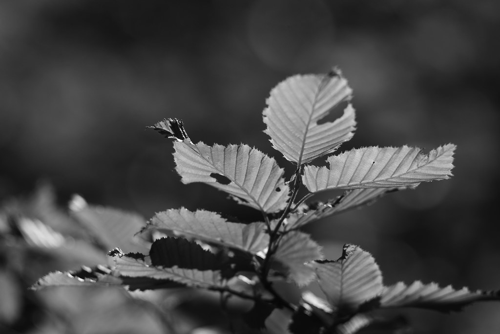
Usually, I like strong b/w shots, with deep inky blacks and bright whites. Kind of the opposite to the thousand shades of grey shots I often associate with b/w, and personally don’t much enjoy.
I guess I just like the drama.
With the same setting using the Jupiter-37A though, the results were more muted, more grey, more vintage somehow anyway.
In this instance I like the difference, and it gives the lens a distinct character over more modern, clinical and contrasty lenses.

This is something I want to work on more, shooting enough with each lens I have remaining to really get to know its personality, charm, and unique strengths.
Whilst the colour shots I made recently with the Jupiter-37A grabbed my attention first, these b/w photos have steadily grown on me, and further cemented the lens’s place in my core kit.
How about you? What are your favourite lenses for b/w photography, and why?
Please let us know in the comments below (and don’t forget to tick the “Notify me of new comments via email” box to follow the conversation).
Thanks for looking.
What Next?
Share this post with someone you think will enjoy it using the buttons below.
Read a random post from the archives.
See what I’m up to About Now.


I think my best lens for black and white is the Pentax K 55mm f2. But I believe any lens from the 70s and older will do black and white nicely – that is what they were designed to do, as all serious photography up to the early 70s was done in black and white. Later coatings were “improved” for color but don’t necessarily work as well for black and white. In Pentax-land, the K and M series from the 70s are probably the best of both worlds – they do color and monochrome both very well.
My Sigma 30 1.4 Art is no slouch either. In the “12-Month challenge” I created over at Pentax Forums, this month is “Normal FOV” month so I’m rediscovering that Sigma, as I picked to have it as my main lens to shoot this month… I believe it’s a newer lens with an old soul, as it’s not overly corrected (you see CA show up wide open) and it has no low dispersion or APO or any kind of fancy elements, just a single aspherical element and the rest is just normal optical glass. I love it.
Ah, that’s a lovely one, I had the K 55/1.8. I read that optically it’s the same as the Tak 55/1.8 but in K mount not M42 screw, and my experiences bear that out – I couldn’t tell the difference between the K 55/1.8 and a Tak 55/1.8. Also I believe the Tak 55/2 was just the 55/1.8 that didn’t close quite so far, ie they just crippled it slightly so it was “only” f/2, not f/1.8. This meant Asahi had a new budget lens for very little development cost, and with a tried and tested optical formula. So again, I couldn’t tell the difference in output in the Tak 55/1.8 and 55/2. And really that extra fraction of a stop makes very little difference, especially when one uses the lens around f/4 or f/5.6 most of the time anyway!
I’m not familiar with that Sigma. The only ones I’ve had have been the Super Mini Wide II, I think they were called. A 24/2.8 I had in K mount and another mount, probably Konica. Very decent performance and focused pretty close.
Hi Dan,
I haven’t decided yet, but I have that lens, and mine is shockingly sharp. I really can’t get over some of these cheap Soviet lenses.
It’s a beautiful world! I’ve started formulating a wish list again, of FSU lenses. Helios, Tair, Jupiter, Mir, there are at least half a dozen I’d love to have.
I tend to prefer B&W images with deep, inky blacks and bright whites also. That said, there is something special about B&W images with a very wide range of tones, and a near infinite shades of grey, if the subject matter matches that sort of palette. Portraits and landscapes in particular can be stunning.
Yes I agree it can sometimes work. I’m also more inclined to be more receptive to greys with a DSLR somehow. With a digital compact I just want more grainy, inky, rough and ready kind of photos.