
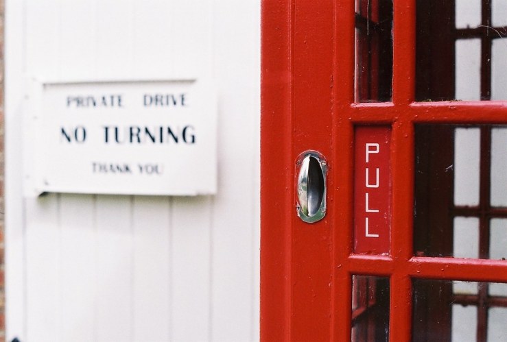
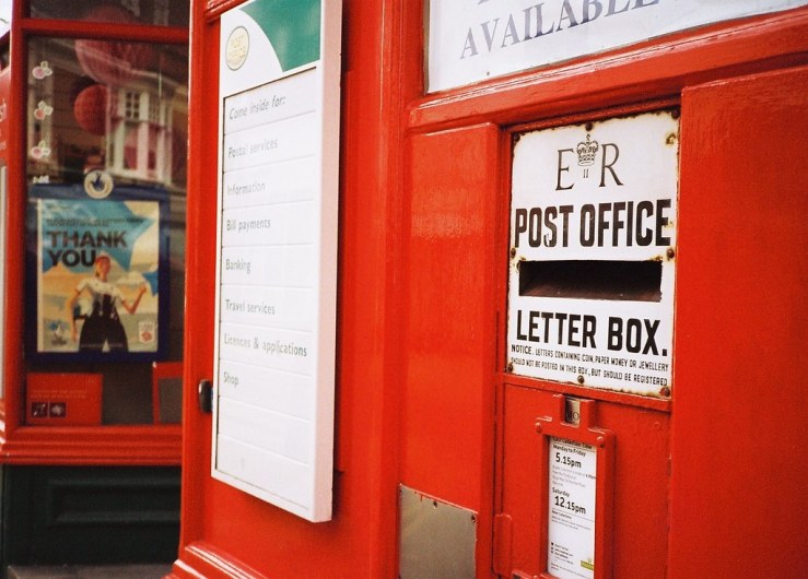
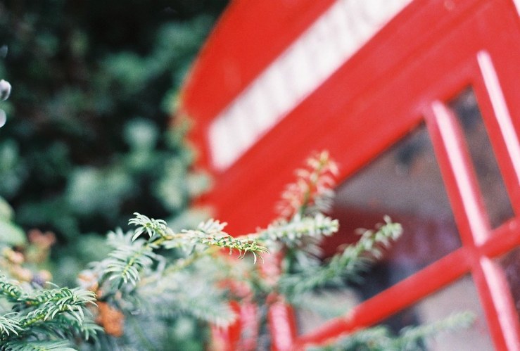
One of the best tips I read when I was fully immersed in film photography was simply “shoot red”.
The theory is that anything red looks pretty great when captured on colour film.
And on the whole I found this to be very sound advice indeed.
(Ironically, with digital, red is one of the hardest colours to get right, without it looking garish or over-saturated!)
Here are some of my favourite film examples of when I saw, and shot, red.
How often do you shoot red?
Please let us know in the comments below (and don’t forget to tick the “Notify me of new comments via email” box to follow the conversation).
Thanks for looking.
What Next?
Share this post with someone you think will enjoy it using the buttons below.
Read a random post from the archives.
See what I’m up to About Now.


Yes Dan, red…
However, I think that it isn’t so much “red” that stands out, rather it is primary colours.
Yellow does the same as red, though I would accept blue, not so much.
As an aside, I really like the kind of colour that film manufacturers were capable of in the early days. I am thinking of some of Saul Leiter’s work here, where the reds are almost burnt orange.
Stephen, yes I can recall photos of yellow that have a similar impact. Mostly flowers, though we have these signs here that mark where water is (I think) that I photograph quite often as they’re usually well weathered.
Like this –
The right kind of blue can be very vibrant too, as can green leaves, especially against the backdrop of blue sky.
I bought a book of Saul Leiter’s work earlier in the year. I really liked his colours, and how he often used surrounding architecture (window frames, open doors etc) to give a different kind of frame within a frame in his photos.
The post has made me think about showing a colour to focus on when going out for a walk with my camera
Good to hear that it’s got you thinking about a different approach. Yes I’ve done a similar exercise, just looking out for just one colour. It’s amazing how it changes your outlook. Then of course you can do it again in the same place(s) but focusing on a different colour.
I’m not sure I would agree with red being difficult to get right with digital, although red is certainly a strong colour that easily takes centre stage. Recently, I did a small project on the colours of the British and French flags, so again, a fair amount of red: https://karinelphoto.wordpress.com/2019/07/30/tricolore/. My profile pic also suits the theme 😉
Karine, what a great idea. You could do this with other flags too, though the frequent presence of blue sky and clouds gives you two out of your three for the tricolore.
Trying this for, say the Italian flag might be more challenging. Plenty of green in nature though, so perhaps not! Anyway, love the idea.
Your profile pic looks like a rusty chain on a red background? No white or blue!
Sorry, my fault for not being clear: my profile pic suits your red theme, not my flag one.
On the flag theme, that’s given me the idea for a challenge to my readers… Thanks for prompting it!
Ah yes, that makes sense, it’s a fantastic shade of red too!
Great re the readers challenge, can you tell us more?
It will all be published on my blog in due course…
Thanks for following it, btw!
Definitely, the color red on film has always looked incredible. Things have improved with regards to digital cameras’ abilities to capture red in a way that is appealing and natural looking. In the early days of digital cameras red always looked terrible. TV/monitor technologies also had a difficult time displaying it correctly. Things have improved greatly on that front as well.
I think I need to practice my reds on digital more. But thinking about it, red flowers are probably easier than white flowers, which often blow out.
Other red objects are fine on digital, I was thinking mostly flowers with very rich and saturated reds in the flesh anyway.
I know my old Sony digital point-and-shoot (mid 2000’s) had a hard time accurately reproducing red. Red objects always seemed to be very noisy and the tonal transitions just appeared “off.” I noticed that with a lot of cameras of that era, but it has gradually gotten better over time. Today, I think the situation is drastically improved.
I very rarely shoot color, so looking for red when I’m out with my camera isn’t something I’m generally doing. However, I plan on trying to shoot a few rolls of color negative film in the coming months, especially as Autumn weather begins. I’ll try to remember to keep an eye out for red subjects now that you’ve brought it to mind. Thanks, Dan.
Yeh I think reds often come out more pink with certain older cameras. And look overly saturated, but perhaps that was my lack of knowledge in the past and how to underexposure a third or two thirds of a stop to counteract that.
I shoot red whenever it’s in the scene I shoot. 😀
You are correct that digital cameras struggle with it; something to do with over-compensating when filtering out infrared I think. Every camera I’ve looked at favours green-blue on ‘normal’ settings.
The thing that makes any colour stand out is contrast. Not in the black & white sense, but in the colour accented sense. Look at your own examples; other colours are either muted or absent. If they were present at the same intensity of the red they would compete with it. That is an effect which can also ‘work’ but is rarely found in the real world because we purposefully create colour contrast for good reason, whether it’s the natural habit of a flower to attract pollinators or our human need to draw attention to something we think is important such as the post box.
So why does colour film seem to accentuate red? I didn’t do anything with these images, they are all on film, and all were processed and scanned at a supermarket lab with a Fuji set up.
I’m surprised, because Fuji was always known for film with a green bias to it. Kodak purposefully leaned towards red because their research showed people prefer warmer tones.
As for film itself, it’s built in layers with red at the back because it’s the longest wavelength and can ‘travel through the most interference’ as it were. At my high elevation we literally have more blue available, whereas at lower levels (or with anything else causing filtration) there is more red. Your eye doesn’t notice this because your brain adjusts to the surroundings. Cameras don’t have any such interpretation beyond what the manufacturers put into the film dyes or the sensor construction.
Ah, so I’m guessing this is why you can flip film over to make redscale, and the longer you expose, the less red the result. The light penetrates further through the first red layer, the longer you expose.
On a related topic, I’ve thought a fair bit about letting a camera sensor (or film) just do its thing, and let its own natural character and tones come through, versus processing everything shot on any camera/sensor/film so it all looks the same, and as a photographer you then have a very consistent “look”.
I think I prefer the former approach, giving each sensor/film a strong say in how the final tones appear. This is one reason I’m really enjoying my old CCD sensor Pentax DSLRs, their “natural” output (ie straight out of camera JPEGs, not post processed at all) is very pleasing to my eyes, and doesn’t need any further processing. As soon as you start doing any processing, it’s difficult to know when/where to stop and you spend more time processing than using the cameras.
Yes indeed! This is why I don’t shoot RAW. You should be able to get the results you want right out of the camera, à la film. In-camera adjustments to mimic certain film types not withstanding, as that is more ‘set and forget’ for a series of shots than tweaking each and every one.
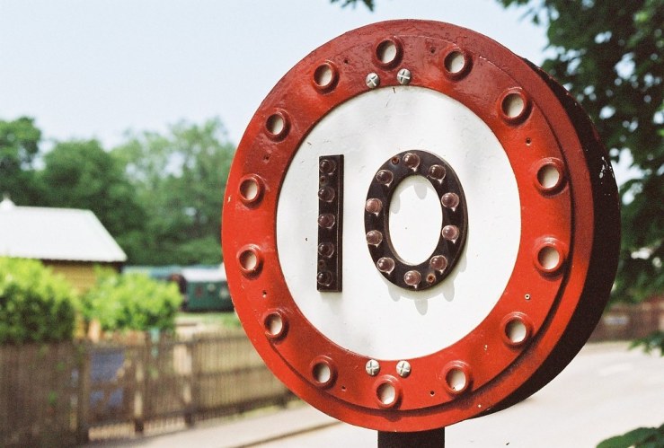
Is that “10” the village speed limit? I wish our signs and postings were so charming. And that our motorists were required to slow down, so! From my experience I would tend to agree rather heartily with your comment regarding red being on the tricky side with digital but I’m intrigued by some of your other readers’ disinclination about that notion….since I’ve got a relatively limited point of reference, it occurs to me I should explore this more.
J, the 10 sign is indeed a speed limit, but it’s on site at an old steam railway station (the line is called The Bluebell Railway – https://www.bluebell-railway.co.uk/bluebell/bluebell.html) where they still have a number of vintage signs and signposts.
Some villages have a speed limit of 20 these days, though most are 30, and the signs are modern – metal discs with reflective plastic stickers on top.
I also thought again about shooting red with digital cameras after other people’s comments, and took a few shots at the weekend. I think I realised that perhaps it’s not so much that red is especially difficult to expose correctly. It’s more like even when it is I don’t especially like how red looks on digital, especially compared with film, like the photos in the post. Whereas most colours – especially greens, which many of colour shots feature – I like on digital. Plus black and white looks equally pleasing for me with a digital camera, as long as it’s scuffed up a little!
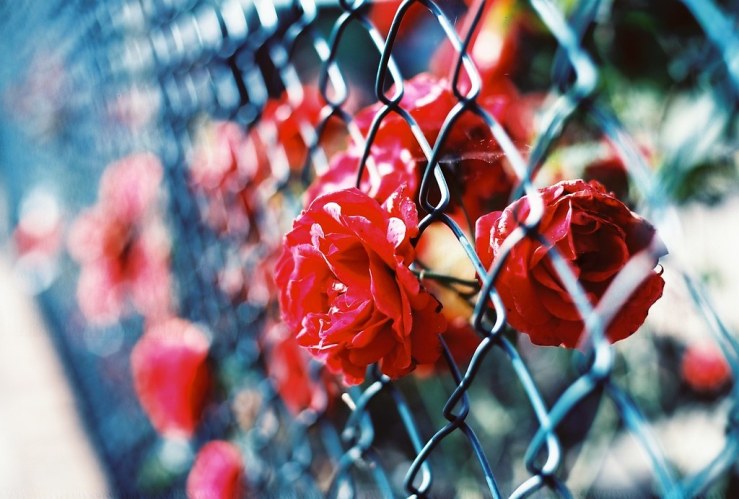
Great shots! I love the flowers in the chain link fence. The red and blue together are gorgeous in that one! Feeling inspired by this!
Thank Sharon I appreciate you visiting and commenting. That photograph was made with Kodak Vision 3 film, which was a repurposed cinematic film stock I stumbled across. It was a super slow ISO 1.6! Most of the images I made with it came out with strong blue tones, kind of like redscale film, but blue.
Great tips. Hope this will help me to do some better in my project
Thanks Robert. Do you have a specific project with shooting red objects in mind?
You are welcome. And yes, I have a lot more thing in my mind expect the red objects
Great tip, and your beautiful photographs certainly back that up! Upon seeing scans from the first roll of Ektar 100 I’d ever shot, I vowed to find more red to include in my images. But I can’t say that I’ve shot much red since then, so thank you for the reminder!
Thanks Marsi, glad you enjoyed the reminder. You can’t really go wrong with reds on film!
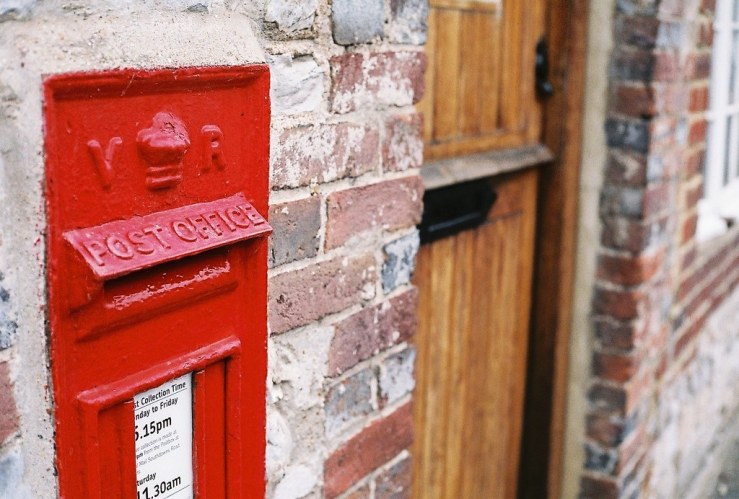
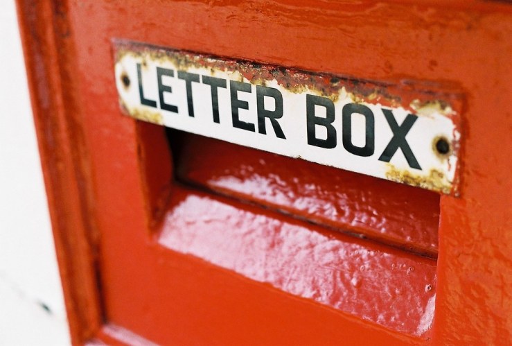
I enjoyed this article and love shooting red, the postal letter box is a lovely capture.
Thanks Melissa, glad you enjoyed it!
Ektar does a good red, speaking of which was that the film you used?
Hi Jannine, thanks for your comments. No, I have used a few rolls of Ektar, but none of the above were made with that emulsion. Most were AgfaPhoto Vista Plus 200 (aka Fuji C200), Kodak Color Plus 200 and Ferrania Solaris 200.